Auto Tagging and Signing with AI
Overview
In the previous year, DocuSign showcased and introduced Auto Tagging, a feature utilizing AI and machine learning to identify fields within a document and automatically place the relevant text or signature fields. This functionality aimed to streamline the signature request process for senders.
At the same time DocuSign made a commitment to customers that they will bring auto tagging capabilities to the signing products within the year. As the mobile team sought to fulfill this commitment and integrate auto signing capabilities into the self-sign product, the team seized this opportunity to solicit user feedback on Auto Tagging and enhance the experience for both our signers and senders.
My contribution
Design Research Prototype
The team
1 × product manager 2 × product designers 1 × researcher
Year
2019
Process
Understanding the Problem
Our initial feedback from our customers is that the new auto tagging feature actually slowed down the process of sending a document for signatures and actually created more work for the user. Since not all documents are created equal the AI model would frequently place the wrong fields and in the wrong spots. There was no way for the user to easily fix this without deleting the fields one by one and doing it manually instead. Also legal required us to have the users opt into the feature every time you enter the tagger. Our current full screen modal annoyed and confused our customers who just wanted to sign quickly.
As mobile looked to implement auto signing I led the initiative to adjust the current experience so it was not as obtrusive and allow users to adjust and edit fields quicker.
Explorations
Making opt in not as obtrusive
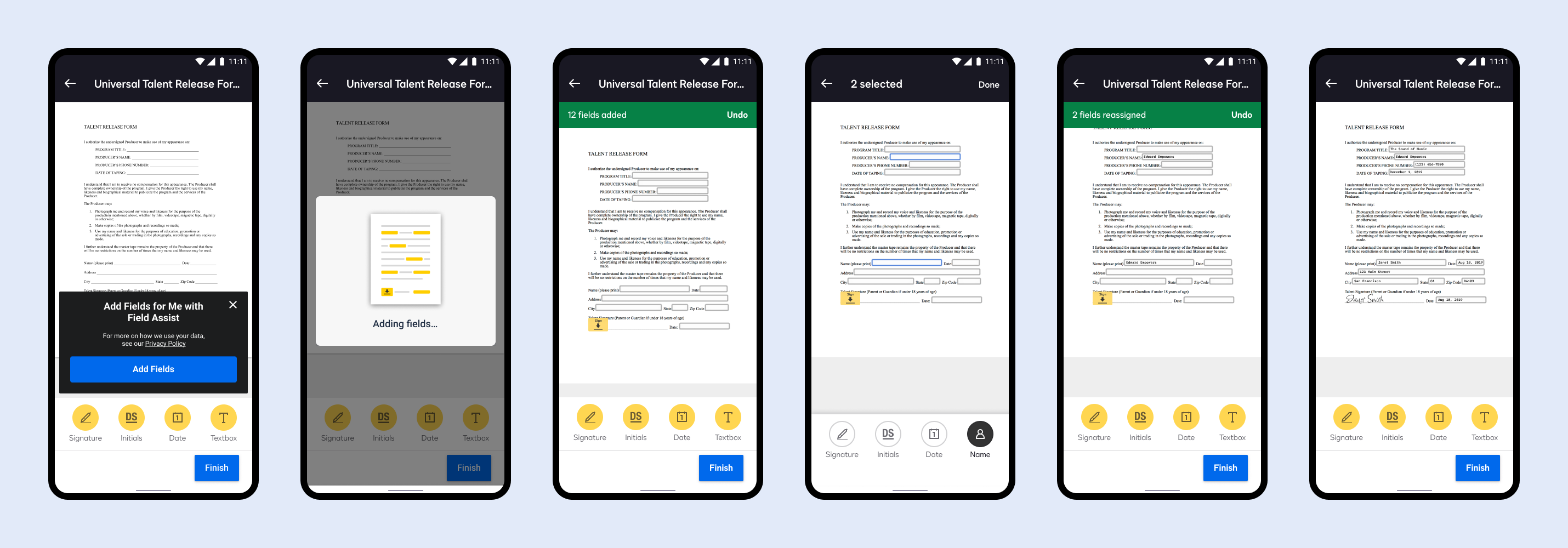
In version 1 the team implemented a full screen modal, but users found this modal intimidating and intrusive. The animation was too abstract, copy was confusing, and the modal blocked you from seeing your document right away with no way to dismiss easily. I spoke to the legal team to see if we can make this a 1-time opt in, but legal pushed back. Because the app uses a 3rd party API to analyze the user's document beforehand we were required to have the user opt in each time while showing our terms and privacy policy of how we use data within the document.
So instead I looked at ways to make the opt in modal as light weight and unobtrusive as possible.
Pushing back on requiring a send for signing
Another issue with building auto tagging first is devs wanted to use the same model for auto signing, but based on our system's infostructure sending is a premium feature of DocuSign. Signing is free. Requiring a user to go through the sending tagger first in order to place fields for them to sign later would not only be extra steps to the signing experience, but it would also require the user to have a Send remaining as part of their plan or a paid subscription.
I put together two flows: one showing auto signing using the sending tagger first and a second flow showing the idea experience for our users that keeps auto signing in the signing experience. I listed out the pros and cons of both experiences and used this as a way to get buy in from stakeholders to work with our devs and API team to build the better experience for our customers.
Allowing users to move, edit, and undo fields
Because Auto Signing was still imperfect I needed to implement a simple way for users to undo auto tagging if they did not like the results. I also needed a way for users to fix any fields that were improperly placed. Since users were familiar with our signature fields palette we used the same component to allow them to multi-select fields and simply delete, edit the field type, re-assign who needs to sign, or mark the field as required.
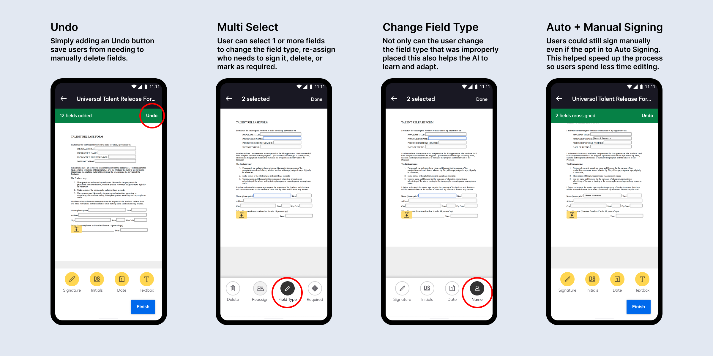
Designs
Testing the prototype
I built a prototype to illustrate to our stakeholders and select customers how simple the auto tagging experience could be while also adding in small touches of animation that made the experience feel magical. The main goal was to show how this simple feature could help save the users time and make them want to use the mobile app to sign documents.
Final designs
Outcome
Key Metrics
✅ 5,000 users opted in to auto signing in the first 90 days
🏁 90% completion of documents after opting into auto signing
📈 7% increase in mobile upgrades after accepting auto signing
🙌🏻 9% increase in mobile upgrades after successfully completing a document with auto signing
What I learned
Even if you build a feature with the intention of assisting and helping your customer to be more efficient in their workflow if the experience actually hinders or slows down the user you will lose their trust and they will quickly abandon the new experience for the previous experience they are more comfortable with. Sometimes a feature is rushed to production and not a lot of times we as designers are able to go back and iterate and improve on features. While we could have simply took the experience we built for auto tagging for sending and replicated it for signing I made sure to take the time and push back on how we could actually improve the experience for both sending and signing. We wanted to make sure the feature was magical to our users and not a hinderance.